Monday 26 June 2017

Art Show

The Art Show was very inspiring. What stuck out to me most were the large installation pieces. I would like to incorporate 3D aspects into my work and perhaps work on a larger scale.

I loved the interactivity involved in this piece.
It is such a unique and creative way to present
what cancer is and really makes you see what it
is beneath what we see on the outside.
I was drawn to this piece by Kayleigh. I liked how instead of just
putting everything on the ground she displayed the work in a
unique way.

I like how this composition by Emily tells a story through a series of
photos and how each photo gets progressively more messed up.


Thursday 15 June 2017

Art Era Research

Impressionism is a 19th-century art movement characterized by relatively small, thin, yet visible brush strokes, open composition and an accurate depiction of light in its changing qualities. Previously, landscapes were often painted in a studio. Impressionists found that they could capture the momentary effects of sunlight by painting outside. Monet is an example of an artist in the Impressionist era. Originated in France.

Modernism is a philosophical movement that arose from transformations in Western society during the late 19th and early 20th centuries. Among the factors that shaped modernism were the development of modern industrial societies and the rapid growth of cities. Inspired by religion. Coincided with pop art and abstract. expressionism. Originated in America.

Post modernism is the belief that all creative ideas have already been made. They portray the world in a real way as opossed to modernism that portrayed the world in a idyllic way. Roy Lichenstein is a post modernism artist. Rebelling against singular way of creating art. Post modernism originated in the 1880s, the term was first used by John Watkins Chapman.

Post post modernism, artistic pluralism. The acceptance that everyone has their own styles. Any creativity is valid.

Wednesday 14 June 2017

Charlotte Caron Analysis

Caron is a young French artist born in Paris in 1988. She aspired to be an artist from a young age and since has been taking steps towards that goal. Caron now lives in Montreal, Canada as she says “there is so much to be inspired by; the vast outdoors, the diversity in culture, the open mindedness and thriving creative community.”1 Whereas when in France she found it was hard to stand out as a young artist and also very expensive to live. Caron is inspired by art history; renaissance and Romanticism however, her art seems much more modern.
I am mainly looking at her paintings and more specifically her animal portraiture series. The painting to the right is from the series, its called ‘Renard’ which means Fox in French. Caron takes a photo of a person’s face and then paints an animal’s face on top in acrylic paint. The size of this piece is 90x90cm, as is all of the portraits that she does like this. Not only does she paint the animal’s face but she also smears the paint which makes the photo and the painting feel like they are merging, she also has created some drips with the paint which suggests the same thing.“The series of paintings/photographs are trying to respond to a form of duality… ultimately creating an osmosis of the two mediums.”.2 The acrylic creates texture on the photo paper and gives the pieces a 3D quality. I am quite interested in experimenting with texture in different ways so this could be good start. Caron refers to duality being the mixing between acrylic paint and the photo, however, I see duality more as he bringing together of the human and animal world which she does by humanising the animal.

The titles of her portraits are always about the animal rather than the human in the piece. She focuses on the “Animalised body (where the man is inhabited by the animal and the animal becomes a man)”3 instead of looking at the animal being inhibited by man or the man becoming the animal. The focus in the portrait is also always the animal as the identity of the human is hidden, this is to show the personas which we live and hide behind every day. The photos are all taken against a white background and the clothes the person is wearing is often very plain. This also takes the focus away from the human and in contrast the animals are bright and colourful which suggests to me that humans are not superior to animals and that we are very similar to animals and shouldn’t take advantage of them. Looking at these portraits has inspired me to look into spirit animals and the history behind them. For example how spirit animals are obtained: by letting an animal choose you and become prominent in your life, through dreams etc. this could be a way to choose what animals go over people’s faces in my own work or a quicker and more simple way could be by making a questionnaire and seeing what animals people are most like.

The scale is kept the same for all of the pieces in the series which when looked at together there is not one that stands out over the rest. This works well as it is clear it is a series when exhibited. Caron loves to mix mediums to get her topics across so I could experiment with different medias and not just copy the mediums that she uses. Caron uses photos of her friends instead of models, this is also something I could do to link my paintings to me. “I re-interpret the image and the document with various technical means; transformation, mixing, deconstruction, reconstruction”3 In Caron’s pieces she doesn’t use the colour straight from the tube “mixing” which makes the pieces more personal; this is something that I could do myself in my own work. “Transformation” links to her transforming the photo of the people into acrylic paintings of animals. “deconstruction, reconstruction” could link to how she paints over her photos- destructing them and then reconstructing them by turning them into animals.

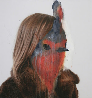
This piece is Red-Gorge which is Red Bird in French, I am looking at this piece also to show how her series of these paintings are all very similar. The piece is 90x90cm just like Renard. The background is white just like Renard to not take away focus from the portrait but unlike Renard, the clothes that the model is wearing are not white. She is instead wearing a brown fur coat. I think this works well as In Renard the white clothes work well with the white fur on the fox whereas the brown coat works well with the red feathers of the bird. It also aids the suggestion that the people in the photos are transforming into the animals as they are wearing clothes of similar colours to the animals. In Red-Gorge the model is at an angle instead of straight on like in Renard, I think this works well with the bird as it gives a 3D aspect to it however the fox being straight on works well with the fox as it looks as though the fox is staring at you and captures the cunning personality of a fox better. 

Caron has dripped paint which takes away from the realism of the painting but also gives the feeling of transformation and surrealism.

References:
1-      http://knockmag.com/portfolio/charlotte-caron/
2-      http://trendland.com/charlotte-carons-painted-portraits/

4-      http://charlottecaron.fr/

Peony Yip Analysis

Yip is a young artist living in Hong Kong. She is inspired by animals and calls herself “The White Deer”1 as this is her favourite animal and colour. She says “With animals, everything is just one way. They’re born, they grow, they prey and they breed, which is everything so naturally done. That’s why I like tying them to my drawings, kind of a reminder or a statement.”1 Her name “The White Deer” links to the drawings she does, like her drawings she is a human with an animal linked to her. To link this to me I could do drawings of my friends and draw the animal they relate to on top in Yip’s style.
Yip’s work does not have individual names but instead she names the by series; this series is called Wildlife. In this series, Yip draws a human face in graphite and then draws an animal face over the top in red coloured pencil. She draws the animal and human in the same sort of position which makes them both look similar. This made me think about looking at spirit animals as the humans look like they could be transforming into the. In the drawing to the right, both the wolf and the girl are looking to the left and slightly up which makes the girl look as if she is howling with the wolf. The wolf is in red which makes it stand out more compared to the grey drawing. This makes me think that the animal is the more important part of the composition. Yip also seems to think this; “they make up for the stupid things that humans do. I know I’m being too forward but humans always find a way to bring stupidity to another level.”1. For this series, Yip quotes Jim fowler “The quicker we humans learn that saving open space and wildlife is critical to our welfare and quality of life, maybe we'll start thinking of doing something about it.”2 Which suggests that this series is all about how we need to think about working with animals and saving them instead of working against animals and nature and destroying everything.
Yip creates many pieces based on animals and humans together, she has another series called Peculiar in which she uses animal masks to hide the humans’ identity. This reminds me of my other artist’s work; Charlotte Caron. They both look at the theme of duality by bringing the animal and human world together, however, she hides the people’s identity in a different way to Caron. Yip’s work doesn’t feel as though the human is transforming into the animal but more that people are wearing a mask as opposed to Caron merging the human and animal together. She quotes Robert Bloch- “Horror is the removal of masks.”2 Which suggests that she feels that we are all wearing masks, perhaps she uses animals because of their innocence or maybe the animals show our true, primitive side.

In this piece  to the left she only uses pen, unlike the series Wildlife where she uses some colour. This makes the mask and the human feel more realistic, whereas in wildlife the animal is drawn on top in red in an unrealistic way. There is an emphasis on the animal here as we can see the animal’s face and not the human’s so like in wildlife it feels as though the animal is more empowered than the human.

This piece to the right is part of a series called ‘Circle of the sun’. Here Yip has obviously been influenced by Japanese culture. In each piece, she has painted a red circle and leaves the background white just like the Japanese flag. She has also has drawn the person in a Kimono and has drawn the hair in a Japanese style. I could mimic this in my own work but instead use Native American culture to fit in with my idea of looking at spirit animals. 
Like in most of her drawings she has used mainly graphite. For the red paint, she has used gouache which is something I’ve never used before so it might be something I experiment with later on. Like in her series ‘Peculiar’ Yip has used animal masks to hide the identity of the person she has drawn, this time it doesn’t feel as though the animal is more important than the human because of the detail put into both the animal mask and the person’s hair. It instead feels like the person is hiding behind the mask or that the mask represents the person’s personality due to the being drawn in the same style.

A running theme in all of her work seems to be being quite simplistic. She rarely does backgrounds and when she does they are very simplistic like her ‘Circle of the Sun’ series. She also uses colour in a minimalistic way with red being a colour she uses in many of her series. Red is a very bold colour so she may use it to make things stand out against her black and white drawings.

References:

Valerie Davide Analysis

Davide was born in 1938 and passed away the beginning of 2017 in East Sussex. She was born in London but due to the war she stayed with her Grandparents in Cornwall. She later moved to East Sussex. While in east Sussex she had a studio near the sea yet she kept her work solely to drawing animals. She was described as a shy person which could explain why her surroundings didn’t influence her much; however, her home was adorned in her art and different abstract objects, she expressed herself within her home1 which is also something I do as I am much more comfortable working at home. Davide used to be a councillor and used art therapy often which is something that I aspire to do in later life which is another reason that I was drawn to her work. She has work up in a small gallery in Devon which I would like to visit if I have the chance.

Unlike Caron and Yip’s work, Davide doesn’t create series and instead names individual pieces of work like this piece named Alfie, its 41cm x 29cm. Davide drew this with just charcoal which is a medium that I don’t have much experience with but would like to use. I’m drawn to her work because it’s so expressive, the other artists I have chosen are very figurative so I want to look at Davide’s work for her loose marks. Davide seems to name her work after the animal’s name rather than making up her own name for the work. This makes the work feel more personal to the animal
In this piece above, the focus is on the dog’s face. Davide has created more shading and more defined features whereas the rest of the body looks more like a sketch. She also leaves the background white which means that you only focus on the drawing and keeps the drawing looking more like a loose sketch. Davide retrained herself to draw with her left hand which is how she gets such loose, expressive marks. I could do some drawings with my opposite hand to get the same expressive marks that she uses.
Davide mostly draws dogs but she also draws other animals like in this piece of work  to the left named ‘Amadeus’. It is 27.5” x 21.5”. She has used charcoal again but this time has used less contrast than in ‘Alfie’. The focal point of the drawing in the eye as she has created more detail in the eye than the rest of the drawing. Davide has also used sharper marks on the horse’s face as opposed to the smudged marks in the rest of the drawing to draw your eyes to the face. There is no colour in the composition like ‘Alfie’, however, ‘Amadeus’ feels darker in meaning as she has only used dark grey and black tones, there is not much white, negative space as there is in ‘Alfie’.

This piece to the right is called ‘Spot’ its 24” x 30” This is one of her few pieces in which Davide has used oil pastels to add colour to her piece. As with her other compositions the face of the animal is the focus point, with the rest of the body looking more like a sketch.

A lot of Davide’s pieces including ‘Spot’ are clearly drawn from a photo instead of real life. She uses depth of field to distort the animal’s face and cause the noses of the animals to appear much larger than they are in real life, making the animal look out of proportion and less realistic. It looks as though they have been taken with a fish eye lens so this could be something I experiment with. In addition to the unreal proportions of the dog in ‘Spot’, Davide uses unrealistic colours in the composition. Along with the loose marks, the bright colours suggest a more childish and innocent drawing in contrast to the dark charcoal she normally uses. Despite this, she still uses charcoal to draw an outline and also uses solely charcoal for the nose to emphasise the dark tones of a dog’s nose.

 I don’t think any of her work has a particular meaning and is instead made by her to express her true self and just for fun. She seems to enjoy making loose, abstract marks and I think she uses charcoal as it’s easy to create quick contrast but also easy to smudge for mid tones and therefore easier for her to make a more abstract looking piece. Her abstract marks is the main reason for me looking at her work as the other two artists I have chosen are more figurative and their work is more complex. Furthermore, unlike my other artists, Davide draws mostly domesticated animals which is more accessible for me to take pictures of.

References:

1-      https://www.maycontainmutts.com/gallery/about-us

Presenting our Work

On Tuesday we finished and presented the compositions we've been working on. I didn't really want to present mine as I'm not happy with it, however, presenting the work had given me confidence to actually put my work on display as I don't enjoy creating large compositions or presenting. If I had more time or was doing it on my own accord I wouldn't have finished the composition as the piece just wasn't working. I would have started again with larger photos smaller boards and I'd have chosen a board with more texture and colour to compliment my photos. I added too many photos in the beginning to the board and then took off the ones I could remove which left a large negative space that I struggled to fill as nothing I added looked right. I settled for re-adding a photo I took off and placing it back on slightly off of the board to add some interest and make my work feel less square and rigid which looked better than just leaving the negative space.

When presenting my work, I placed it next to work that used the same sort of textures and where there was work that varied in size so there wasn't too many large pieces in one axrea.

Sunday 11 June 2017

Art Trip- The New Art Gallery Walsall & Birmingham Museum and Art Gallery


Overall the trip was very inspiring. I fell in love with Rachel Goodyear's work in The New Art Gallery; I have always loved the effect that watercolour can achieve and her work was a great example of the beauty of the medium.

I could do something like this with
my own work, I could hang pieces
and play around with the shadows
they create.


I took this photo while walking out
at the end of Goodyear's 'Oracle' animation.
I'd like to incorporate shadows into my work
in some kind of way.

This is a composition of small pieces done my Goodyear.
the three photos below are some of the pieces that are a part of it.
Here she has used a
material to add a 3D
aspect to her work.
This is something I
could try.

This is part of Goodyear's 'Oracles' animation. Its made me think
about how art doesn't have to be a drawing on a canvas but instead
can include music and movement to evoke an emotion.

Other than Goodyear's work the other piece that stood out to me was this:
This composition consists of some
abstract shapes which act as a
platform for a dancing woman
that is being projected onto the shapes.
Using a projector is something I really
want to experiment with and so I was drawn
to this piece of work.

I have been to Birmingham Museum and Art Gallery before and so didn't look around too much and I didn't take many photos, however, I did look around the 'I Want, I Want' exhibition. The exhibition stunned me with how unique and different all of the work was. I enjoyed the concept of being able to walk into a small theatre type room to experience videos in isolation from the rest of the work and was also drawn to a piece of work that was interactive and had a game incorporated into it. I like the idea of art being interactive and so may begin to incorporate this concept into my own work. ( These two photos are not my own http://www.birminghammuseums.org.uk/bmag/whats-on/i-want-i-want )